|
by Saffron Sener 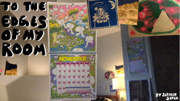 Almost every time I have video called into school or extracurriculars from my bed, I am asked about the weird wall space above me. My bed is tucked into an alcove, six or so feet wide and three or so feet sunk in from the rest of the wall. When I am just a head in a Zoom square, the blank wall corners stretching above me look simultaneously like they’re dozens of feet tall and encapsulate me into an unusually small room.
I wonder, if to all these new faces I see in my classes, whether I am memorable as a person or as a video square. Do they associate me with my voice, face, movements, as we might in a normal semester? Am I a person? Or do they remember me by my background, my room, my head as a foregrounded, flat object laid across these things? The girl with the weird walls. Do they remember me at all? And I, to them - when I think of the new people I have met through my Zoom classes, I think of them as these faraway characters. People, yes, but people I don’t really know, no matter how many lectures we attend together-apart. At the beginning of this semester, I told myself I wouldn’t write anything about COVID. Not even words like these which are not necessarily about it but rather existing during it. I just felt like writing words related to this pandemic would grant it a sort of finality I didn’t want to give up. It already chokes every conversation. It is on the tip of all our tongues, all the time. COVID must be talked about, yet we all want desperately for it to have never existed, never crossed our minds. Last Spring, I studied abroad in London. COVID shut the Italy exchange program down in late February. Since that moment, my time abroad felt like it was slipping from my hands; one after the next, programs got shut down. My program, UCEAP English Universities, was the last in Europe to get the “go home” email - mid-March, almost exactly nine months ago. I remember refreshing my Gmail app every thirty seconds, dreading the announcement but wishing it would just get to my inbox already, the stress of knowing what was to come, but still hoping maybe it wouldn’t weighing me down. But, I can’t do it. I’m going to kind of write about COVID. It’s raining, and the internet in my neighborhood is completely out until several hours from now. I’m writing this on the Notes app. My life, at times like this, feels like it barely exists beyond the confines of my room. So precarious, wired carefully to the rest of the world by a finicky stable-unstable Wifi connection. On my walls hang the art I have accumulated over the past few years. The walls are less cluttered than years past, because I figured when I moved into this room in August that a less overwhelming space may help yield a less overwhelmed brain for the upcoming online semester. Two prints from the East Bay Zine Fest, and two from the East Bay Print Sale, which typically would take place on the same day in December, resulting in me spending too much money as I rushed from West Berkeley to Oakland before the artists I loved had their tables cleared out of stock. A print from a zine fair in London, which I was too afraid to put on the corkboard of my dorm there but had to shove into my luggage when I moved out almost three months early. A tapestry of Hieronymus Bosch’s Garden of Earthly Delights - it’s right by my desk, and I wonder if people can make out what it is when I talk to them on Zoom. A tapestry of cows that I got at a food market in London, behind my laptop. A risograph calendar from Wolfmann Books in Oakland, which I forget to turn at the beginning of each month. One of my favorite parts of a semester is accumulating new things to adorn my walls. Prints, postcards, tapestries, post-it notes - anything I can make stick. But these things that are on my walls now feel wrong. They’re of a different world, one before nine months ago, one where I wasn’t confined to my room for 95% of the day. They are my things, but they feel old, outdated - foreign, in a way, like I found an old box in the attic and unloaded its content onto my walls. Bygone, perhaps. I love these things, but it is difficult to see them when they are all I have to see. Like my walls’ decor, my classes feel strangely not-mine. The Zoom gallery squares are a collage of faces and names, people I won’t know beyond this screen and won’t know me either. The mysterious, seductive anonymity of unknown others in a lecture hall has been replaced by the ability to stare at myself for a whole lecture, or entirely erase my peers and pin my professor to my screen. An hour never feels like an hour, more like a day or a minute. I struggle to feel like a real student, or even person, and not just a collection of thoughts stuffed into a body. I should go for a walk, but it’s still raining and oh - it gets dark at 5:00pm now.
0 Comments
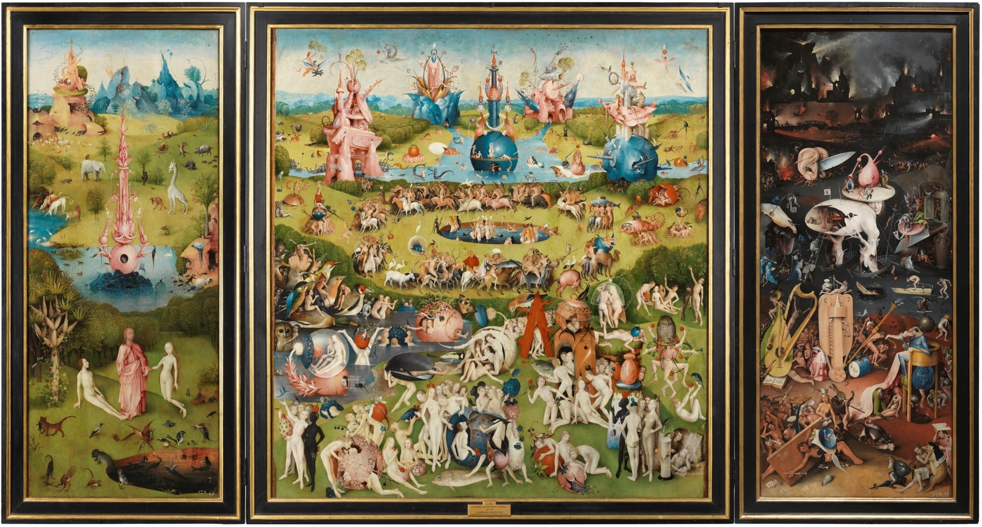
by Saffron Sener 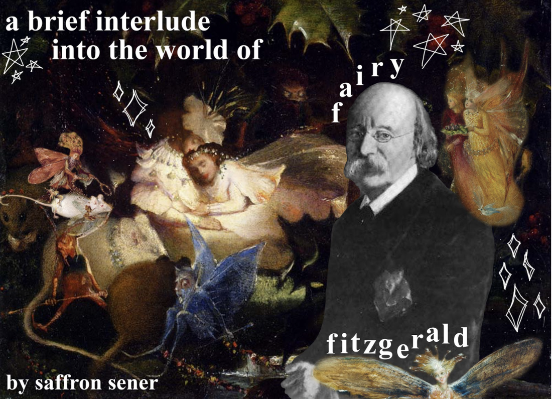 If you ask, I will tell you that the focus of my studies in art history is Flemish art. That’s untrue, though, for two reasons: 1) in my time here at UC Berkeley, I have never been able to take a Flemish or Northern Renaissance art course, because, frankly, they aren’t available and 2) my real interest is in weird art. By weird, I mean monsters, little beasts, witches, mythical creatures, allegories, fairies, angels - but mapped onto our world, or early modern perceptions of our world. Think the Bruegels, Albrecht Dürer, Hieronymous Bosch, Francisco Goya, Fra Angelico, John Martin. I don’t necessarily need my art to move me to some great emotional conclusion; I want to be endlessly interested by its strange characters and unique perception of reality, by a glimpse into a world more magical than my own. But I’m not writing this to ruminate on my internal turmoil about my art history concentration. I’m here to talk to you about Fairy Fitzgerald. A 19th century English painter of fairies, dreams, flora, and fauna, John Anster Fitzgerald embodied a very Victorian fascination with magical otherworlds. He became known as “Fairy” Fitzgerald by his contemporaries for his loyalties to the creation of fairy scenes. Strange, elvish creatures fluttering beside miniature peoples dressed in acorns and flowers, commiserating with kittens and baby bats (A Cat Among Fairies), or maybe a rabbit (Rabbit Among the Fairies). Long limbed, sharp winged things scratched across the canvas, fluttering over ocean waves that tumble over each other onto a seaweedy beach (Sea Sprites). 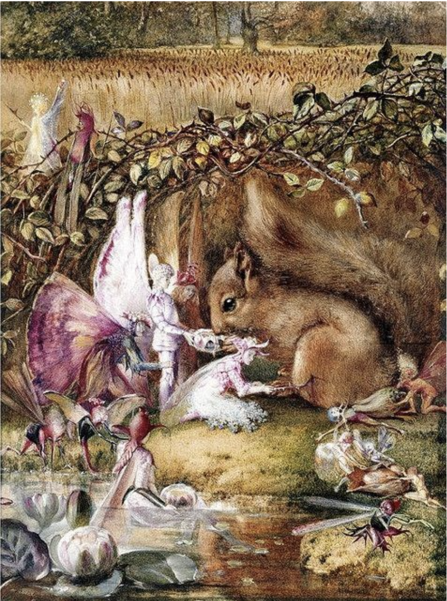 The Wounded Squirrel, John Anster Fitzgerald, likely 1860s Works like that above feel like an attempt by Fitzgerald to reckon with the rapid industrialization of his native United Kingdom and the destruction of its natural landscape. We’ve all likely learned of the peppered moth, whose quick evolution from a white and black mottled coloring to a wholly black coloration was due to the intense exponential increase in industrial smoke in 19th century England. This pollution was so severe that soot blanketed the English countryside, enveloping trees so thickly that only the darkest moths could be sufficiently camouflaged and survive. The tangible effects of unfettered, destructive industrialization were growing into themselves during Fitzgerald’s lifetime, and the natural world of this period was much more suffocated, unstable, and under threat than that of a century prior. The Wounded Squirrel depicts a far different human relationship with this world. Humanlike creatures (made more pure by their expansive, colorful insect wings, and humbled by their miniature size) heal an injured squirrel; there is no dominion of one over the other. The background of this piece extends into an untouched, idyllic meadow. There is no soot, no smoke - Fitzgerald utilizes mythical beings to imagine a reality much unlike his own in 1800s London. I attempted to learn about Fitzgerald’s upbringing or artistic background to better understand his great allegiance to the fairy genre. However, I found little information because there is little information to find; his biographers and the few art historical considerations I unearthed about him all agreed on his vague personal life. His birth date is unclear, sometime between 1819 and 1823. He is assumed to be a self-taught artist, but is known to have been exhibited in the Royal Academy of Arts in 1845, when he was likely in his mid-twenties. His father was a generally disliked poet by the name of William Thomas Fitzgerald whose poetry was rooted in English patriotism. Beyond that, though, his early life remains very shrouded. 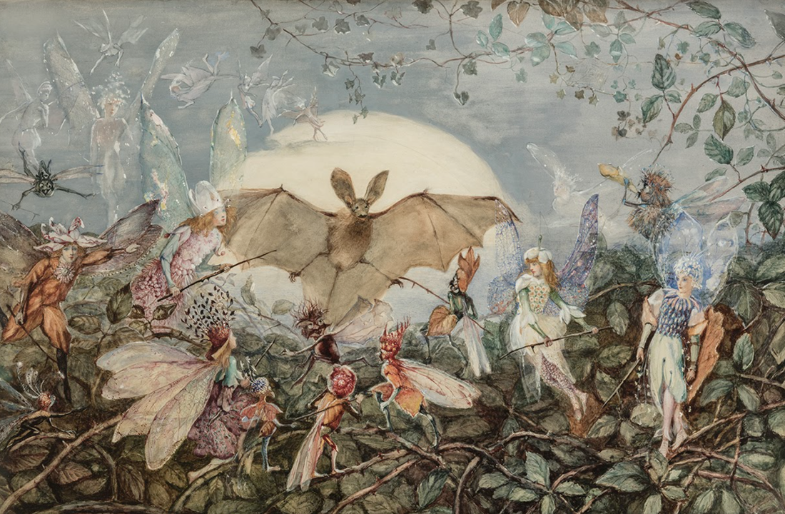 Fairy Hordes Attacking a Bat, John Anster Fitzgerald, 1860s Perhaps one of the more appealing aspects of Fitzgerald’s works to me, though, are their ominous undertones. Fitzgerald’s worlds appear beautiful, tender, enchanted. Yet, they are imperfect, almost sinister at times. Elegant fairy crowds watched over by fiendish things crouched in the canvas’ corner; they are whimsical, otherworldly scenes with an edge of danger creeping ever closer. His dream-related works feature impish creatures, hovering above sleeping subjects as they drift off into slumber (check out The Artist’s Dream for an example). Many tie his works to drugs like opium, a Victorian favorite, and the precariousness of psychedelic trips. Teetering between perfect wonderland and magical ruin, his scenes feign eccentric perfection. Yet, they are delicate fantasies; yes, in Fairy Hordes Attacking a Bat, there is a legion of little fairy people with wonderful flowery outfits and shimmery, iridescent wings. But they’re actively attacking a bat with broken twigs, forcefully pushing the wide-armed animal deeper into the background. What does this mean for Fitzgerald’s world? There is violent conflict - war, even. These scenes are no utopia. Fitzgerald melds the beautified ideal of a fairy - this half-human, half-butterfly thing - with Gothic, dark themes of his surrounding 19th century, of reconciling with the reality of nature being choked out by the grip of industrialization. He is very much a part of a somewhat disillusioned, fanciful movement; think Peter Pan (1902/04), by James Matthew Barrie, or Alice in Wonderland (1865), by Lewis Carroll. Whimsical, fantastical, but underpinned by a sense of deep instability and malevolence. Dripping with drug-induced, entranced imagery, tiptoeing between a sensational reality and hellish nightmare. A world that seems extraordinary and its dark, absurd reflection. In my opinion, one of his more captivating pieces is Fairies in a Bird’s Nest. Encapsulating that ever-present tension between the seemingly ideal fairy lifestyle and omnipresent threat of imps and devils, this painting calls upon Bosch’s Garden of Earthly Delights with its characterization of white, flowery people set against a populated, almost grotesque woodland scene. The body crawling into an eggshell at the bottom middle is a direct citation of the middle panel of Bosch’s triptych, where a crowd of bodies clamber out from a pool of water and into an eggshell. Light shines upon the head of the forwardmost woman in the nest, bathing her and her compatriots in a heavenly luminescence. The creatures encroach on this blissful twig shelter, crawling forward from edges of darkness - as if repelled by the radiance of these women and the flowers that lay across their bodies and nest, they do not enter. 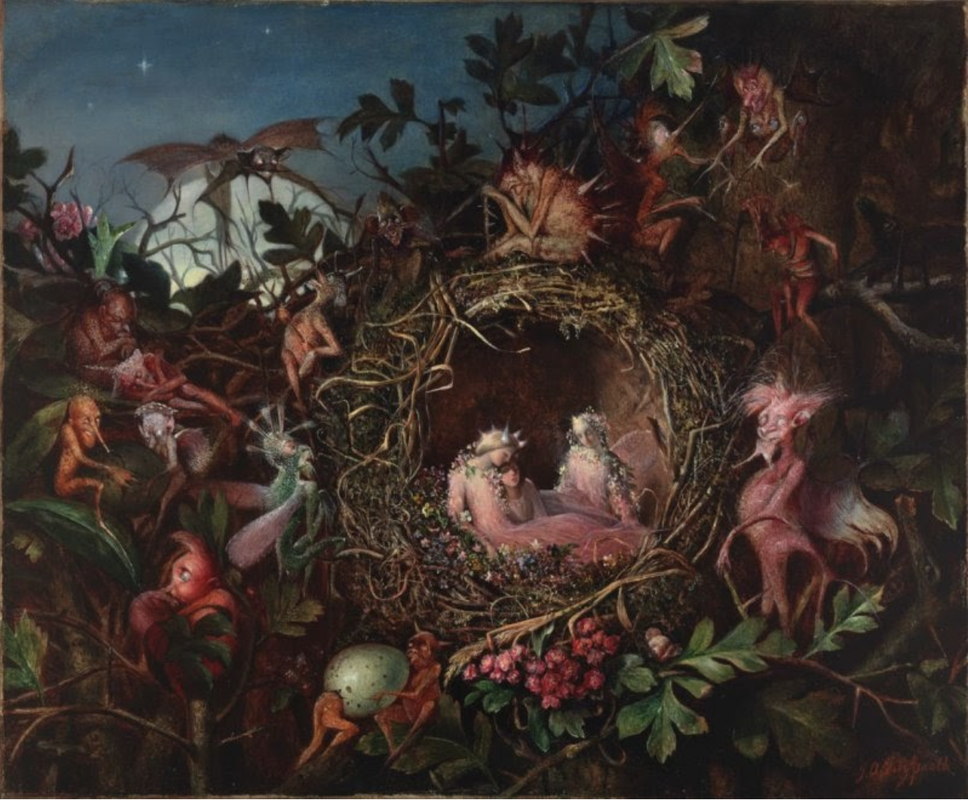 Fairies in a Bird’s Nest, John Anster Fitzgerald, 1860 I find, too, that there is a certain ability to map queerness upon this work; the closeness and tenderness of this moment, of these three women sheltering from the devils and imps that abound beyond the limits of their twig nest, feels particularly queer. Maybe I’m projecting my own queer desires (of living in a bird’s nest with my partner, not so much the devils surrounding us), but I do really struggle to believe these little fairy ladies drape themselves across each other and that twig shelter platonically. That’s so much more boring to me than if they were lovers, waiting out the night and the devils that reside within it. If I may really lean into a queer reading of this work - perhaps the devils and imps represent the hate-filled, monstrous perception of “sin” regarding homosexual love, and the soft, safe nest embodies a sort of queer refuge. I have no reason or evidence to believe that this is what Fitzgerald intended. I also understand that he was a man, so tracing a woman-centric queer love narrative onto his work is not particularly realistic. Does it really matter, though? This painting is meaningful in that way for me. Maybe I’m making Fairy Fitzgerald turn over in his grave. But, fairies, sprites, and their magical realm holds so much queer possiblity for me. My housemates and I all agree that Pixie Hollow Online was a communal gay root for us. Fairies in a Bird’s Nest just takes me further down that rabbit hole.*
* Oh, and it has an absolutely amazing twig frame - original to the 19th century. I swoon. By Saffron Sener  At my best, I have between nine and thirteen rings adorning my fingers. This collection has developed since the day I realized that although my mom rebukes the wearing of jewelry, I, as a person separate from her, canin fact wear it anyway. My collection is vast and highly varied; from that which you accumulate from toy dispensers at pizza parlors to my prized $25 opal band, my fingers have worn it all. Although I have amassed hundreds of rings - the horrible ornamental things of my experimental middle school days, my now-refined silver bands and signets - there remains one type of ring I admire the most, yet never have had the pleasure of wearing: a posy ring. 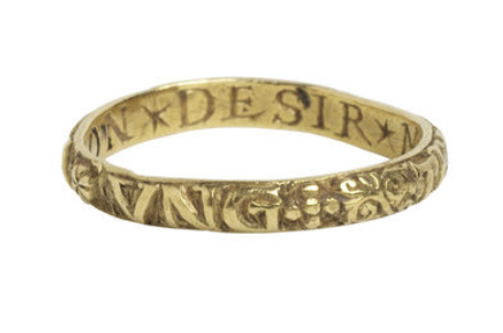 A 16th century posy ring, inscribed with “un temps viendra” (exterior) and “mon desir me vaille” (interior). Of course, my greatest impediment to owning a posy ring is the simple fact that they are from a bygone era and place: early modern Western Europe. Sure, I could certainly obtain a modern version - if it were not for the hundreds of dollars that endeavor would cost me. Even more cash, though, if I wanted a genuine medieval relic; on the low end, approximately $2000 would get me a “late medieval gold posy ring”. For those who may not know, a posy ring is a ring (surprise!), often a simple band of gold, inscribed with a posy, or rhyme. The inscription can be on the outside or inside of the ring, though most I have come across boast the more secretive rendition, with the engraved rhyme on the interior of the band. They were a late medieval, early modern phenomenon, most popular from the 15th to 17th centuries in England and France. Though I mainly associate them as being tokens of affection given between lovers, they could also signify gifts of respect or prestige (especially in examples where the rings have been encrusted with a jewel of some sort). There is something about this alliance of text and ring that is endlessly appealing to me. Of course, the ravenous historian in me loves that they’re historical objects I would happily wear now and use (and abuse) as a means to make every conversation about my personal historical interests. But, as a writer, and as someone who has often found a certain poignancy in text that I fail to reach in spoken word, these little posies simply radiate tenderness and passion. You wouldn’t go through all the trouble of inscribing a gold band with a few words of rhyme if you didn’t resonate wholly with those words. Especially when you consider that many rings were inscribed on the interior, and thus were not an immediate or obvious display of wealth; rather, they were a personal message, passed between individuals bound by a golden band gracing one of their fingers. Perhaps they feel so meaningful because their message is hidden, tucked beneath a ring of gold. Or maybe it is the action of those words existing against your skin, directly in contact with your person, your body, pressing against you with no barrier, no boundary. The words are truly yours; they are tangibly connected to you every moment the ring is on your finger. 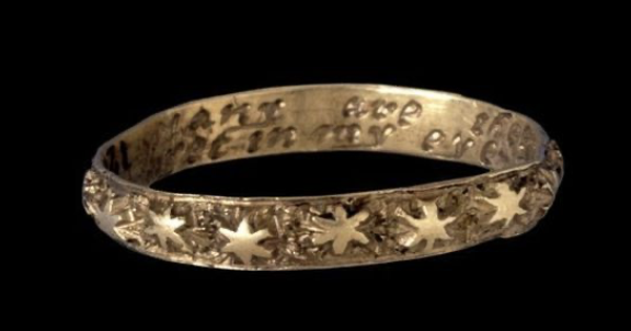 Oh, how I swoon. 17th or 18th century posy ring, inscribed with “Many are the stars I see but in my eye no star like thee.” Beyond the ring’s basic construction, though, are the words. The ring carries with it not just the inherent value as a luxury item, a gift, but the added significance of text. The gifter offers not only an extravagance, but the ultimate romancing: a line of poetry. Like a lock of hair, or a wallet photo, a bit of that person is with you, but even closer - their words meld with your body as something that you wear, perpetually hugging your finger. At a posy ring’s base, the meaning is derived from those words or symbols engraved upon it. Otherwise, it’s just a band. Arthur Humphreys’ 1907 A Garland of Love: A Collection of Posy-Ring Mottoes catalogues an alphabetical list of just what the title says. Some are swoon-worthy, while others feel nonsensical in our modern age. They are just a few words (limited, of course, by the size of the band), yet feel so personal, so purposeful. I have collected a few of my favorites below:
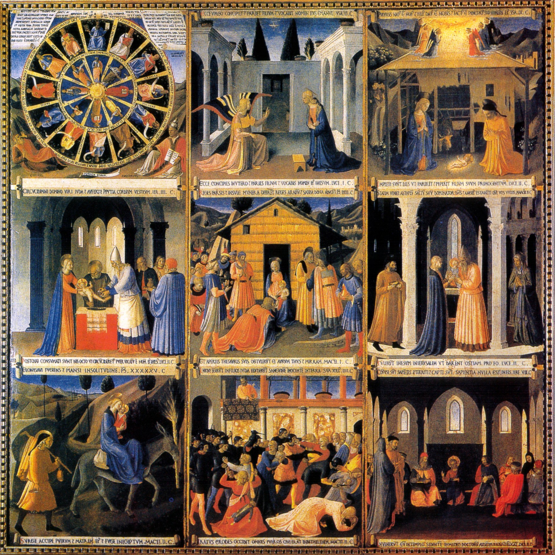
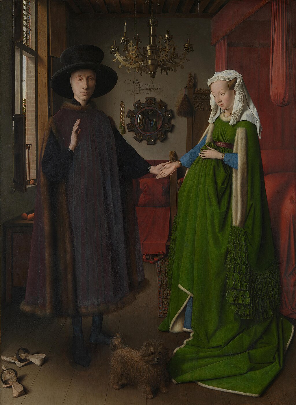
On a broader note, I admire the medieval tradition of integrating text and art. The concept of merging word and visual culture or art is typical of the early modern Western world. You can see it in paintings, as well; Fra Angelico’s 1450s Armadio degli Argenti, a set of nine panels depicting Jesus’ life, is bordered by Latin text explaining the corresponding scene of each panel. Illuminated manuscripts exemplify the ultimate medieval combination of text and image. In a more playful way, Jan van Eyck signs “Johannes de eyck fuit hic,” or “Jan van Eyck was here, 1434,” on the wall of his Arnolfini Portrait. 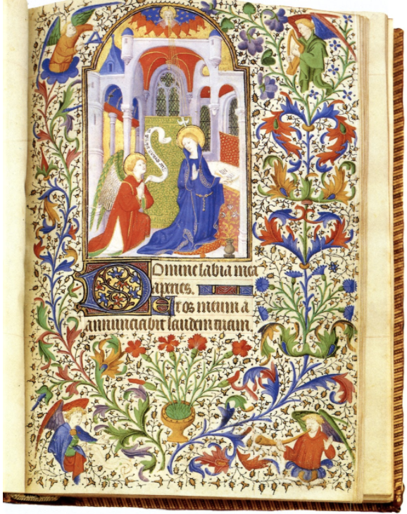 A page from a French illuminated manuscript, the Book of Hours, dating to 1410. Notice not only the words below the illustration of the Annunciation, but the strip of text within the image as well. And, of course, the beautiful, colorful natural decoration filling the page! Considering its era, the inclusion of text proclaims something unattainable to most: literacy. The ability to read in your vernacular, be that English or French (although there is the occasional Latin inscription) was reserved for certain classes - those who could afford education and those who were educated by the church. With the innovation of the printing press in the 15th century, the accessibility of text as a mode of communication between the greater populus of Western Europe certainly expanded. But was the common farmer or barkeep reading through publication upon publication to locate the perfect line for their sweetheart? Likely not. Even more unlikely when considering the cost of gold and the expense of inscribing it. So, this was a fashion of the rich - unsurprisingly, and somewhat disappointingly. I want so badly to imagine two commoners in the English countryside, dressed in bonnets and tunics, sneaking about and sharing their secret affections tucked away behind the bands on their fingers. I want to think of them romancing each other by candlelight, creating poetry out of their love and feeling the need to capture it in the valleys of a ring’s engraving. Of course, this idyllic image is shattered when I remember their sense of hygiene, or lack thereof, and what it would be like to be a commoner or a woman or generally a person in 15th century England. The magic of the posy ring remains, though. What would I want on the posy ring I’d give to my partner? You set my heart ablaze, forever and always.  A 17th century posy ring, engraved with “trew love is my desyre.”
by Saffron Sener  When I started taking birth control pills, I imagined that they would come in some plastic case, probably pink or lavender, slightly reminiscent of a Polly Pocket case or a compact mirror. I’m not quite sure why. Did I see this in a movie? Art? Advertisements? A baseless assumption?
I picked up my prescription from Walgreens, waiting until I returned home to open the box. There wasn’t a whole lot that I looked forward to with the pill - beyond pregnancy prevention, it left me with the fear of becoming a hormonal mess for a few months while I adjusted. So I really wanted that cute, plastic case. Something about it was so appealing; it was a special container, a little home to these oh-so-important pills. But when I opened the box, I didn’t find a plastic case. I found a piece of cardboard-esque material, folded over once like a booklet and encasing a foil package full of pills. The color scheme was kind-of cute, yellow and orange and pink, but where was my case? Where was my pills’ cute home?* There are so many brands of the birth control pill. And they all look so different. Why? What creative drive is motivating these companies? To answer this question, I’d like to conduct a basic analysis of six oral contraceptive brands and their respective designs. They include, in no particular order: Kurvelo, Levora, Seasonique, Jolessa, Enpresse, and Ortho Tri-Cyclen. Each name is hyperlinked with images of the brand’s pill pack; feel free to reference these images throughout the article. They are the same ones I based my analysis on. One baseline throughout pills that determines an aesthetic choice is the inclusion of at least two pill colors. For the combination pill, at least. This indicates to the consumer which pills contain hormones and which are the placebo, or inactive, pill. Kurvelo opts for an orange hormonal pill with a pink placebo, similar to Levora’s pink placebo and white hormonal. Seasonique’s turquoise pill perfectly matches its case (what a statement!) and is paired with a light orange placebo. Enpress and Ortho Tri-Cyclen’s pills assume a multitude of colors; for the former, pills move from pink, white, orange, to a greenish blue while Ortho Tri-Cyclen’s pills fade from white to blue to green. Interestingly, the most utilized colors appear to be orange, white, pink, and blue/green - consistent also with packaging. Across these six examples, not a shred of purple or brown or even black beyond the typeface is to be found, really. So, it becomes clear that one wants warmer tones, sometimes earthy, when it comes to their pill - but why? Orange and yellow communicate a certain energy, almost happiness. Pink - well, that’s the girl color, right? (ha, ha). White is simple, clear, unassuming. And blue/green are calm, like nature, not scary. I wouldn’t be opposed to a goth, all-black pill pack, but a brown one… maybe that’s too earthy. The typeface is typically black, other than in Jolessa and Enpresse, whose brighter colorways keep the more colorful text in line. Other than in the brand name, it’s always sans serif. The scary medicine words are the casual font while the brand name is a professional counterpart, serif and all. The lucky ones, Levora, Seasonique, and Ortho Tri-Cyclen, come in that coveted plastic case. Levora’s could almost be an accessory by choice - light pink, with a seashell embossed on the front. Ortho Tri-Cyclen resembles more a pale yellow compact mirror, while Seasonique appears to be a more practical way to hold its multiple layers of pills. So, for me - Levora wins. But the choice of a seashell relief stands out. It’s cute, but there are implications. Seashells symbolize fertility (which I’m trying to avoid by taking the pill - some irony?) and femininity. Some light research yielded that the scallop shell represents salvation in Christianity. Either way, still interesting and somewhat surprising meanings. I must say that I appreciate the pinstriping of the Jolessa and Enpresse packages. Extremely similar in their overall “look”, these two brands overlap in their striping, menstrual pad-looking outer packages, and layout of pills and words. Both appear to be produced by Barr Pharmaceuticals, so this likeness makes sense. Nevertheless, it’s still worth noting. Is there a deeper meaning to be reached with the comparison of birth control pill packages? Likely not. But, they represent a niche, aesthetic design that is somehow extremely varied and quite similar. All of the packages sort-of look like they were created in the late ‘80s or early ‘90s, but they assign a particular warmness, almost a personality, to an otherwise sterile medicinal practice. Unlike a generic orange pill bottles, these packages have life - they are all different, sometimes cute and sometimes not, with some correlation but lots of divergence. There is a person, or a group of people, behind these appearance-based decisions; there is some arbitrariness in whether the package is a circle or a rectangle, yellow or pink, cardboard or plastic. This is an untapped alcove of vernacular aesthetic design - look out for how your birth control pill package compares. . * Would it be a home or an apartment building? I mean, seeing how each pill is in its own plastic case, maybe it’s an apartment building? But I guess an apartment can be a home. Or is a pill pack truly a cooperative? by Saffron Sener What follows is an exhibit proposal. It is a curated collection of multiple pieces all relating to each other as per the below-explained theme/title. This blog post is meant to exist as an online installation accessible to all. Please consider the included pieces as if you were visiting a physical gallery. Enjoy! 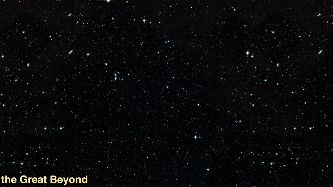 Exhibit Title: the Great Beyond Pieces, with their display captions: Powers of Ten (1977) by Charles and Ray Eames https://www.youtube.com/watch?v=0fKBhvDjuy0 This short film (nine minutes) was created by couple Charles and Ray Eames. It documents their perception of existence as it would appear at different levels of magnitude. Zooming in on cells and out on the universe, this work combines scientific interpretation with art in its reckoning of life at every size. Etc. by Ryan Heshka acrylic + mixed media on board, 2007 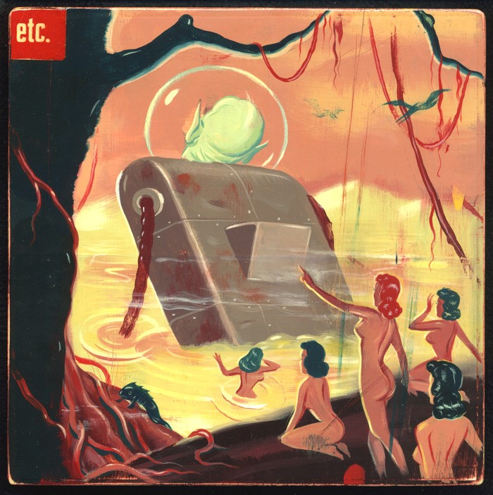 Depicting a group of women and a mechanical beast moving outward from view, this imagining of alien life is colorful, intricate, and wonderfully weird. Heshka draws on pulp fiction cover art from the early to mid-20th century and adds his own eccentric flair and narratives to create windows to other worlds. Assorted Pulp Fiction covers, unknown artists 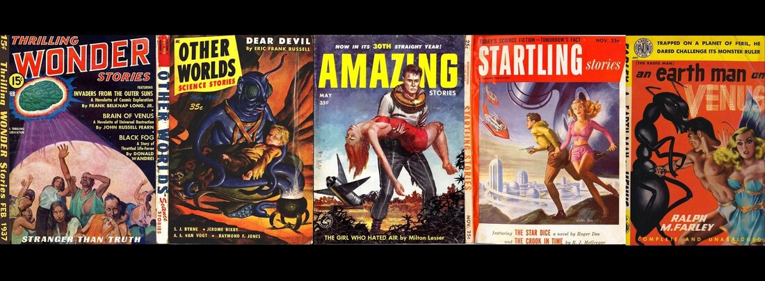 A small assemblage of an almost endless collective, these pulp fiction covers display peeks into their subjects, from space adventurers to overlords to aliens. Hailing from the 1930s, ‘40s, and ‘50s, these illustrations allow modern viewers an idea of how authors and artists viewed life in outer space and beyond, granting a portal to the science fiction of yesteryear. Christ and the Virgin Interceding for Humanity Before God the Father by Lucas Cranach the Elder oil on lime, 1516-1518 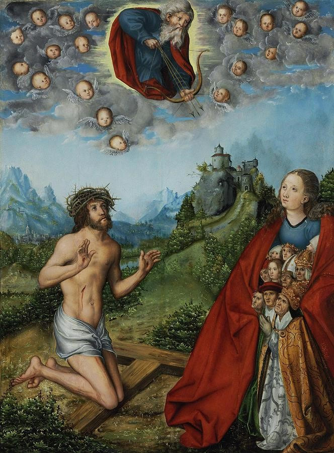 For centuries, the stars of space were not necessarily its most compelling aspect; space was also the home of God and Heaven. In this piece, Lucas Cranach the Elder asserts the dominion of God as the skies and the dominion of humanity as the Earth, laying a clear spatial divide and emphasizing the divine aspect of the atmosphere (and beyond).
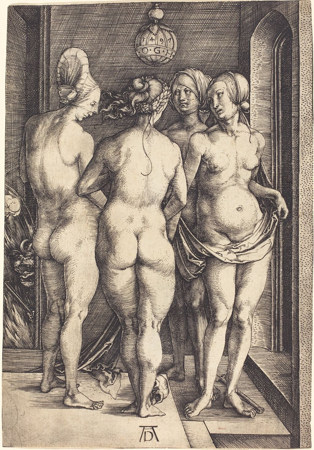
A short playlist including five songs "Brave Captain" - fIREHOUSE "I Hear a New World" - Joe Meek & the Blue Men "Get Up" - The Blow "Synthesize Me" - The Space Lady "Portofino 1" - Raymond Scott Each of these songs diverge in genre and topic but remain related and valuable in their perceptible treatment of space, the future, or the Great Beyond in some way. Exhibit Description Our lives are spent wholly under a blanket of stars. We can only see them for half of this time, but they are always there. And humanity has confronted this omnipotent presence in endless ways. This exhibit will delve into perceptions of the Great Beyond, be it visions of aliens or God, tales of space-explorers or the sizes of everything. We begin with a realistic imagination of the universe. Its distance and abstractness pose no barrier for scientific exploration. Charles and Ray Eames tackled this in their short documentary film “Powers of Ten” (1977). Bringing our view of the universe out to 100 million light years and then 0.000001 angstroms in, the Eameses take their viewers into the fibers of the beyond in two directions to confront the magnitude of our existence. This film wrestles with the relativity of everything, braving potential existential consequences and qualms. The 20th century lent itself to visualizations of the future, of the far-off and magical 21st century. With attempts to pierce space (like Sputnik or the Moon landing), space became synonymous with progress; one cannot separate the Great Beyond from its connection to forward movement. It is in the world of the future where space becomes approachable. Raymond Scott, an American composer who invented and constructed his own synthesizers, drum machines, and other electronic instruments, affirmed the direction of music into the future with his experimental tracks like “Portofino 1”. The happy, yet almost pensive song is a collection of electronic sounds tied together and fit for play over a tour of the metropolises so often imagined of the future. His technological compositions paralleled images of an automated, advanced future. But, there are aspects of the cosmos and our interjection of humanity into that space which necessitates discussion. Why - why does our species look up to the skies with dreams of divinity and exploration? Is it an age-old fascination of that which is just beyond our reach or is it something more? And, in this age of planetary collapse - how ethically can we dream about outer space? Should we look to the stars for hope or should they act as reminders of our own relegation to this planet which is currently being killed? Listening to “Get Up” by The Blow exposes us to one person’s grappling with the hoarding of resources by older, richer people. Rather than enter the Great Beyond of outer space, this person sings of “the Internet ghetto” that’s “all made of light,” all that’s left for people “too late to get the 3D real estate.” For this person, it’s not the stars that provide an outlet for their future, but rather the digital lifescape. Often, outer space is referred to as the “Last Frontier.” The concept of a “frontier” is complicated and often controversial - the word itself implies untamed, ready-for-the-taking space, but often buries the reality of that which already exists. We can look to American history for proof of this; as white settlers moved further and further west, further and further into the “frontier,” they paved their way through the destruction and decimation of Native lives and natural landscapes. Though the United States prefers to remember history through the glorified lens of Manifest Destiny, this requires the denial of a very real Native American genocide. How does this translate to the Great Beyond? Well, like images of cowboys in Old Western films, there are the heroes and adventures of mid-20th century pulp fiction novel covers. White men and women are seen battling the native inhabitants of whatever far-off planet they’re exploring, conquering the land and quelling the threat. And other adventures in the “Last Frontier” assume an almost Biblical quality - all-powerful entities dictating life and special children become the center of the space story. fIREHOUSE’s “Brave Captain” tells the tale of an expedition on the brink of mutiny. Exploration gone wrong - a treatise into the inevitable dangers of journeys into the unknown. And yet, it is a lonely dimension, space. There is no sound, no warmth, no song drifting by like Joe Meek & the Blue Men’s “I Hear a New World” feels it would be. And from the human eye, there are only the stars and darkness for miles upon miles upon miles. But it is in those dark spaces that humans have found space to fill. Be it an alien world, as seen in Ryan Heshka’s Etc., or the plane of the divine, as asserted by Lucas Cranach the Elder in Christ and the Virgin Interceding for Humanity Before God the Father, we have lost no time in seeing what is beyond the capacity of our eyes. With love, though, we look up to the stars. The Great Beyond is that unreachable, untouchable, but wondrous space that allows imagination to flourish. We don’t know what’s out there, so anything could be. We attempt to chip away at it with searches for inhabitable planets and journeys to Mars, but it remains as that which is just away from our fingertips - just beyond. “Synthesize Me”, sings the Space Lady, who got her name from an underground Berkeley newspaper in the 1980s. “Hypnotize me - energize me.” by Saffron Sener Every Tuesday for an hour, I teach a Creative Writing course to second-graders at a nearby elementary school. Sometimes equally, I eagerly await and dread this class. Eagerness is inherent; being able to provide a creative outlet for these students as well as the general fun of planning, preparing, and actually teaching makes my experience an enjoyable one. The dread, however, stems not from the students or anything about the school or program I teach through (C.R.E.A.T.E.). Rather, it’s born from my own anxiety and apprehension to lead a group of fifteen-plus seven and eight year olds in everyone’s favorite subject: writing. I began writing creatively when I was in second grade (what a parallel!), but as I was on the younger side, I was about six then. It was something I did for fun, and it was “my” thing; I “wrote” a “book” (100+ pages of elementary-level text very heavily influenced by Sharkboy and Lavagirl) that same year. For me, writing was my path of least resistance; I struggled with math, with grammar, but stories and poems just flowed. This isn’t to say I’m perfect in my writing, or that it’s any better than anyone else’s - rather, I just found it easy and enjoyable to do. This is not universal. Leaving elementary school and entering middle and high school, when writing assignments shifted from fiction to essays and from fun to thoughtful, I began to understand the qualms. The fear of putting pen to paper. The nuances of sentence structure, the need for variance, the consideration given to avoiding word repetition. The panic at a prompt, and being told “no, no, no!” when it doesn’t quite match. The suppression of that creativity I and my peers so fortunately developed in elementary. It grew more potent in high school, when in A.P. and I.B. classes required the churning out of thousands of words every day. “Furthermore,” “for example,” “as shown by,” grew almost as reflexive as including my name at the top, followed by the teacher, class, and date (ah, M.L.A., how I don’t miss you so). Writing words became excruciating at times, especially during timed writes. Fiction - what’s that? I penned a handful of poems/stories in comparison to the hundreds of essays. To get to the point, though, I will address my second-graders. Hopefully, someday far in the future, they’ll stumble upon this blog post and be brought to the six-ish week class they were a part of now. Do not let the crushing weight of academia strip you of your creativity. In my time as your teacher, I have watched each and every one of you step (slowly, at times) out of your shell and each step is more rewarding than most else in my week. Writing is hard. That is a fact. You’ve told me that, when I ask you to write a haiku or about a character in your story. I know that. But in your excitement to share with the class, to take projects home to keep working, to continue having the class despite the school year coming to an end, I see a change - that difficulty is not necessarily a deterrent, anymore. Your poems, stories, songs, and everything else are manifestations of your incredible imagination and in the coming years as a student there will be times where that is threatened. School curriculums are capitalistic constructions rooted in getting the “best” product possible to create a facade of success that in turn funds the institution. The better the school averages, the more money they receive. Challenge that cycle. Be creative. Don’t let the constant wave of essays and requirements dull your drive to write creatively as well, like I did. For a long, long time, I wrote very little beyond that which was asked of me in classes. I’m only now, in my second year of college, falling back into what I love so much. Don’t get lost like I did. by Saffron Sener  Joseph E. Baker’s 1892 lithograph, Witch No. 1 Joseph E. Baker’s 1892 lithograph, Witch No. 1 Joseph E. Baker’s 1892 lithograph, 'Witch No. 1'I’ve always loved witches. This isn’t to say I was that girl in high school who “practiced Wicca” and had a pet rat or tarantula or something of the like. But, I’m (too) well-versed on the Salem Witch Trials. I did have a major Edgar Allan Poe phase from middle school until the end of high school (only a bit drawn out). It’s almost certain I’ve seen more horror movies than you - which, I assure you, is not a brag; I’ve suffered through some truly terrible films to earn that title. Any open-ended paper I can write for one of my many history classes is, most surely, about witches. Maybe it’s that I see a bit of myself in the concept of a witch. Unadulterated rage (of a womyn), rejection of men for a life of seances and spells in the woods, a certain separation from society and lingering in the dark. I’m not ascribing myself to the trope of disgusting woman as witch seen in films like the Blair Witch Project (1999) - only described, never seen - or The Wizard of Oz (1939). Nor am I ascribing myself to the seductive femme fatale witches of films such as Suspiria (2018/1977). In terms of personhood, I am not opposed to a disgusting woman or femme fatale (though these representations are clear manifestations of male anxiety to the idea of a female who rejects men). But, I would rather align myself with the women executed throughout human history for allegedly practicing witchcraft - outcasts of society persecuted for the anxieties projected upon them. I find their stories far more interesting than Wicked (the musical). I find their stories, and the fears cast upon them, more interesting than the boiled down versions of witchiness we get in Hereditary (2018) and Into the Woods (the musical). I’m not even going to touch Harry Potter. But I’m not here to embark on a survey of witchcraft. Rather, I am here to discuss something that truly enrages me; the constant representation of female nude bodies as functions of horror in horror films. I’ve hinged this on witches because the most common representation of women in this genre is as witch, in my opinion (rivaled only by the Final Girl). Look to Hereditary (2018). Or Suspiria (2018). Or The Witch (2015). What is the common denominator of the witches represented here? Their nudity. Not only are these women posed as the villians of the story in their status as “evil” witches, but this is highlighted by their naked bodies. This reliance by horror filmmakers on the female body as an inherently scary thing is abhorrent. Why must each witch movie, like the three above, end in an orgy-like gathering of naked women, dirty and writhing in orgasmic pleasure? pain? Why is the climax of fear, the supposed most scary moment of the movie, depending on the audience’s supposed disgust for the female form (a disgust most definitely reinforced by cinematic moments such as these)? And why do these scenes always seem so similar to propaganda spread since ancient civilization as a way to stir up popular fear towards groups who dissent from the common authority? When I learned about the Bacchanalia of ancient Rome, and the efforts put in by senators to end these non-approved religious festivals, it all clicked. Livy, the ancient Roman historian, writes a scathing account of these events, noting in his History of Rome: “This pestilential evil penetrated from Etruria to Rome like a contagious disease...one way of corrupting...morals was through the Bacchanalia.” In their legislation against the Bacchanalia, Roman senators emphasized their perverse (and made up) sexual nature, their essential nudeness (again, made up), and their being a threat to the sanctity of the Roman pality (really, they were more a result of existing instability rather than a cause). They dehumanized the body, describing sexual relations with animals and luxuriant, gluttonous feasts to accompany. This propaganda, most certainly unsubstantiated and untrue, sparked the usage of the nude (female, as women played an integral role in apparently attracting participants of the Bacchanalia) body as a function of fear. This continues into the Middle Ages and beyond. Works like Albrecht Dürer’s 1497 engraving The Four Witches and Hans Baldung Grien’s 1510 woodcut The Witches are two of many examples; here, again, the women are depicted as naked, outside their norm and thus scary. European perceptions of the female body required its covering to be pure, chaste, and in its “proper” state - a woman’s body in the nude was equal to a complete corruption of the self. Clothing meant civility. Katherine Brown, in her novel, Foul Bodies: Cleanliness in Early America, writes: “nudity...evoked the base, animal nature of corrupt humanity and located spiritual uncleanness in a foul body” (page 15) which was highlighted by the “fundamental uncleanness of women” (page 16) and the equation of “female genitalia...with sexual sin” (page 36). She further notes that when European colonizers encountered Indigenous groups, they were “predisposed to believe that...nudity [was] a sign of both innocence and savagery” (page 44). Thus, it becomes clear that the function of one’s naked body in a public space is that of degradation and shame - a tool for white men to further establish their power over women and people of color.
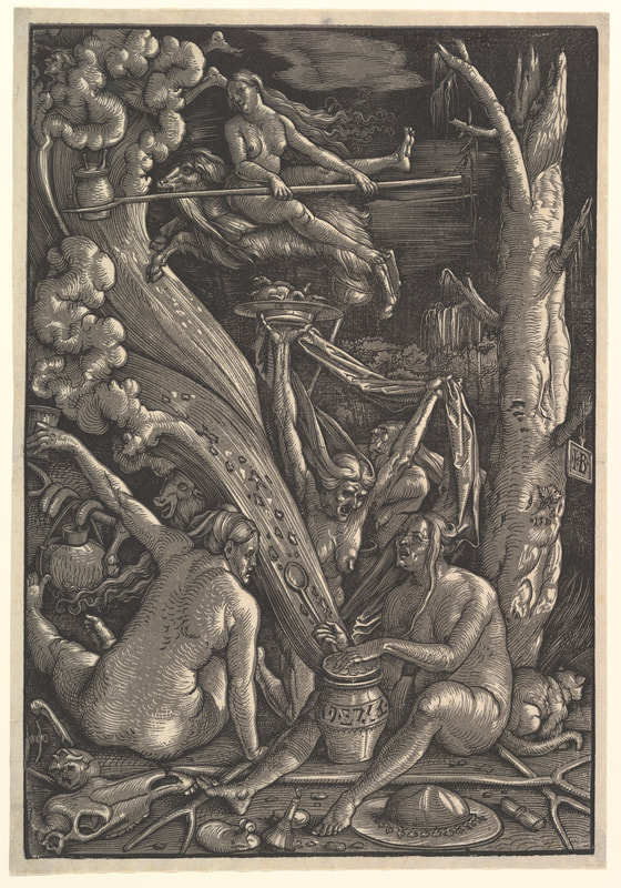
'The Four Witches', Albrecht Dürer, 1497, engraving and 'The Witches', Hans Baldung Grien, 1510, woodcut. Witch-hunts, which plagued the European continent from the 15th to 19th centuries, were the bastard of the Reformation, initiated by religious inquisitors as an inversion of religion. Witches thus became evil incarnate, and over generations large-scale, authority-driven calls for the execution of witches was adopted by the masses. They grew to represent male paranoia about the female body and her rejection of him, as the process of becoming a witch developed around the narrative of coitus with the Devil and regular (nude) witches sabbaths. Witchcraft was given to us by the elite, by the government, by officials, and reworked to become a function of the masses. A fear that we all hold - a fear that reinforces patriarchal ideologies of womanhood and the corporeal body. A fear that serves those who are on top - (rich, learned, elite, ruling) white men - in controlling those below.
And today, it has culminated into a cheap fear tactic of horror filmmakers to invoke this centuries-long development of hatred for the female form, for fear of it. Because, obviously, a group of naked women can mean only two things: the object of the male gaze and a function of their pleasure OR a rejection of their gaze and thus a realization of their fear. So, a note to anyone making a horror film - posing the nakedness of witches as their most noticeable and disgusting and horrific aspect is over. We don’t do that anymore. It’s tired, it’s lazy, it’s male, and it’s time to find something actually scary. Am I asking for the deletion of witches from modern mainstream media? No. I am asking for care, and consideration of the role; a witch in a movie now is not just a witch. She is the culmination of centuries of pain and burden and murder women have endured for witchcraft, the demonization of their bodies in the name of fear, and the creation of an identity in reaction to male anxiety of rejection. She is a victim - of (figurative and literal) violence upon her body by fearful men - yet she is a strong female role model. Appreciate her. by Saffron Sener  I’ve never been comfortable with the Greek/Roman tradition surrounding the rape of Medusa by Poseidon in Athena’s temple. As the story goes, Athena became so enraged that Medusa was attacked in her temple that she punished Medusa by turning her hair into snakes. Essentially, she blamed and cursed Medusa for her rape.
It’s almost like Poseidon himself thought that up, this narrative is so disgustingly male. Ruined by Ovid’s retelling of the Medusa tale and the repetition of this in the centuries following, the story of Medusa that I ascribe to is not one of female betrayal. It’s one of unification, protection, rage, and solidarity. So, I’ve reimagined it here, in this poem: “It was on this stone, your temple, here. Him, Poseidon.” Stand with me. Stand. We must always be standing. Do not bow to me. You may never bow again. The ground is not the place for you or for anyone like us. Raise your head, and look at me. It will be the last time you can, sister. Grabbing, taking, consuming, ruining. The violence upon you is often felt by those like us. (at the hands of my own uncle who is like my father and my brothers and the others. it runs in the family, or is it just their nature?) They pierce. Froth at us. Violate. Walk away with our bodies strewn on ground, See us as open, as the ready sufferer of their desires, entitlement, violence. This is not us. We are not flowers to be picked, lambs to be caught, bodies to be taken. I am giving you a gift Like my helmet, Like my spear. You, too, will have a weapon against those whose existence is protection enough. This head of snakes, biting writhing full of rage and wrath and venom. Not punishment, but security. Not a burden but a blessing, sister. A warning, A curse, A symbol for the pain you must carry for the pain we all must carry. They will run, friend or foe, enemy or lover. This is the gift I am giving you. I am sorry, sister. Go. Look into the eyes of those who pierce and trap them in their disgrace. Remind them from whose body it was that they came and from what body they have forsaken. Relegate them to stone. I’ll shatter them, their ashes will blow across the Earth, forgotten, sent back to a natural place. Where we will walk on them. They will be the dirt where we grow our flowers and raise our lambs. Go, sister, and look. “It was on this stone, your temple, Here. From you, Athena, I become myself, Medusa.” by Saffron Sener 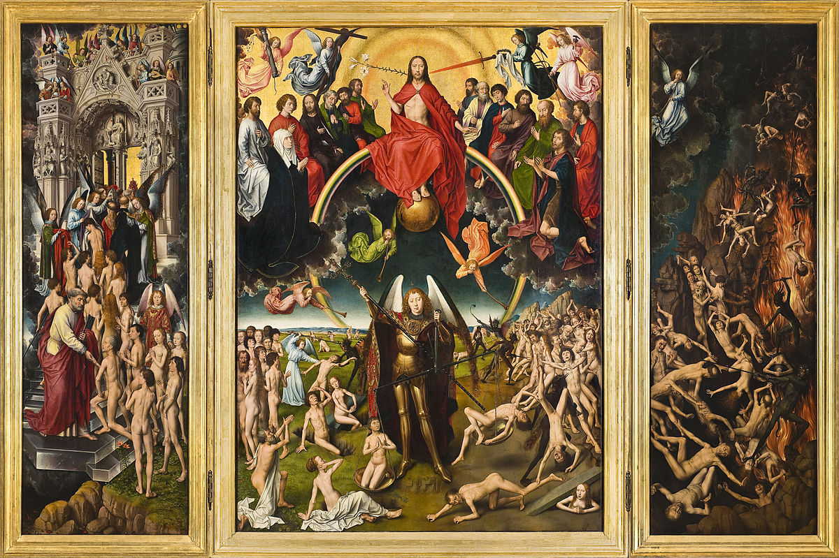 Hans Memling, Last Judgment, triptych, oil on wood, 1466-1473 One of the most prominent (and my personal favorite) scenes in Northern European 14th to 16th century art is that of the ‘Last Judgment’. A Biblical story derived from the more apocalyptic portions of the text, the narrative of the ‘Last Judgment’ or ‘The Day of the Lord’ decrees that following Christ’s Second coming, all on Earth will face evaluation at the hands of God. Each person will be determined “good” or “bad”, and from this judgment be sent to Heaven, Purgatory, or Hell. Look to Pieter Bruegel’s 1558 engraving or the ‘Last Judgment’ half of Jan van Eyck’s diptych for examples of the gothic, dark, moody Northern depictive style. Perfectly odd, grotesque, dark, excessively detailed, and absolutely amazing. This isn’t to say that Lower Europe, specifically Italy, France, and Spain, failed to pay attention to this cataclysmic unfolding. Michelangelo’s mid-1500s Last Judgment pays a sunny, heaven-centric homage to the scene. Fra Angelico’s 1431 interpretation is similar to that of a triptych, with Jesus Christ floating above the rest on a throne of gold. La Gloria by Titian in 1554 is a perspectivally-unique, communicative piece that forces the viewer to look upward towards the glory that was Heaven. The divide between the two regions, as it often is, lays within their respective bright or dark natures, in the gaudiness of one versus the brutality of other, their overall styles as according to the sort of period eye (as Michael Baxandall would say) of either place. We can see collective attention placed on narrative across Europe, with a transition from Heaven to Hell often occurring from up to down or left to right, centered by Mary or Jesus Christ. We can also see an adherence to the concepts of the story, with a clear divide and communication of good/bad between Heaven and Hell maintained in both the North and South. However, in the interest of speaking to one Northern European artist’s rendition of the Last Judgment rather than drawing a developed comparison and contrast between the scene’s treatment in the North and South, I’ll point this towards Hans Memling. Born in the 1430s, Hans Memling hailed from the Middle Rhine region. Little is known of his early life beyond his apprenticeship in Mainz or Cologne and subsequent training under Rogier van der Weyden in Brussels. This is where Memling integrated himself in the Netherlandish art scene. By 1465, he was a citizen of Bruges in Flanders. In 1477, he married a woman named Anne and fathered several children. Successful in his career and popular with Italian patrons, Memling enjoyed relative wealth via his artistic endeavors for the duration of his lifetime. He died in 1495. Typically, despite his Germanic background, he is grouped into the Early Netherlandish tradition and movement due to his location throughout the majority of his life as well as stylistic dealings with perspective and spiritual/mythical narratives. The Last Judgment by Memling is one of the artist’s most-well known. A triptych displaying the entrance into Heaven, judgment by Christ, and descent into Hell respectively from left to right, this piece affixes the Biblical narrative into one - a framework of an almost mythical majesty. About ten feet by seven feet, this looming artwork overpowers its audience in its intense grappling with the apocalypse of life on Earth. On the far left is the first panel, which depicts the ascent of those deemed “good” into Heaven. Saint Peter helps the naked, white bodies of the saved onto the silvery, almost crystal stairs that snake up to the entrance of paradise. Immediately in front of the gate, a group of angels clothe the people in deep-hued dresses similar to their own. The gate itself, surrounded by a stormy wreath of clouds, is in a Gothic architectural style and is adorned with reliefs sat in attendance of those entering. Balconies carved into the passage hold angels in bright clothes and with bright wings playing a litany of instruments. If one looks closely, they can see that the Pope and other high-ranking Church officials are leading the procession into paradise; further analyzing the identities of those supposed worthy in the eyes of the Lord, one may notice the seemingly special facial features, implying their potential representation of patrons to Memling. On the central panel, one can see the beginning of this judgment narrative develop. Seated on a rainbow and draped in a red cape, Jesus Christ stares directly at the viewer. His feet - crucifixion wounds on display - rest on a golden orb. Out of his right side grows a flower (a lily) while a red-hot sword points inward at his left. Behind him is a golden light that appears to emanate outward from his body. Kneeling on the same stormy clouds that surround Heaven are the twelve apostles, who extend in placement behind the son of God. At the end of either line of apostles is Mary, who looks to her son, and John the Baptist, who looks to the audience. Above them all, in the upper corners of the panel, are four angels holding the Instruments of Passion (which Jesus utilized to overcome Satan): a column, representing where Jesus was flagellated, the cross where he was crucified, his crown of thorns, and the Holy Lance driven into his side. Below this floats three angels blowing the horns of the apocalypse point inward at Saint Michael. His figure, as well as the rainbow upon which Jesus rests, separates the realms of Heaven and Hell in the location of the Last Judgment, the valley of Josaphat. On his right, there extends far into the background green grasslands, where people are rising from their graves, angels are fighting with demons over individual souls, and the line into paradise begins. On his left, on the dead, brown land crowds of people are being driven backward by the dark, smoky bodies of demons. Saint Michael stands tall above this, using a balance to determine the goodness or badness of an individual. He wears reflective gold armor, a red cape embellished with designs, and a pair of creamy-black wings that flow into that of a peacock. Using his crosier, the Saint jabs any person tipping towards evil and expels them to Hell. Moving to the final panel, one can see the realities of Hell as imagined by Memling. Grotesque, animalistic bodies with tails, taloned feet, and somewhat dog-like faces torture the souls damned to this realm. Their black bodies represent a hybrid between human and creature, juxtaposed upon the writhing, white bodies of the humans sent to Hell. Fires lick upwards in the backdrop of this panel, with flying demons carrying loads of souls into their reaches, almost like they were kindling. Every face of the damned displays an acute sense of suffering, and most gaze away (potentially in shame) or keep their eyes closed. Notice the disjointed amount of people on the two side panels; far more people were sent to Hell than granted passage into Paradise. Above this scene of torture floats the final angel of the trio in the central panel, blowing the last trumpet of the apocalypse. This piece is gripping, intense, and weird. I love it. In a similar strange, whimsical, fashion is Hieronymus Bosch’s 1482 work of the same name. In both, Jesus Christ sits upon a rainbow ring flanked by the pristine glory of Heaven on the left and the everlasting fires and monstrous demons of Hell on the right. The Lord reigns above a land of naked people and brightly clothed angels, running about during a catastrophic sorting of good and bad and medium. For both Bosch and Memling, the story of the Last Judgment provide a narrative by which the limits of illusionism, curiosity, and symbols are explorable. It’s not often that I, as a student of art history, get to just jump into something distinctly in my interests. I find the classes on the Renaissance abounding, courses about contemporary art a constant availability. And that’s not necessarily a bad thing (though I will contend that Art History, on the whole, is a very Western, very White, very elite field). It’s not a great or good thing either, though. I understand that my now extensive experience with Italian art through its ages has helped build the analysis you just read. But I also understand that this analysis is flawed, incomplete, rooted in a knowledge that is almost entirely self-researched and self-taught. Where the institution has failed me, though, I must grow -- it has and is on me to put the extra effort in to explore what I love and what traditional art history tries so hard to hide (I’m coming for you, Picasso and Pollock). To completely conclude this treatise on ‘The Day of the Lord’, Hans Memling, and the strange darkness of Northern Renaissance art, I would like to acknowledge a somewhat more contemporary rendition of the Biblical scene that may or may not be my personal favorite to date. John Martin’s 1853 Last Judgment is wispy, expansive, and quietly captivating. Unified by an endlessly deep void and flowing in a varied, asymmetrical way, this piece is, in my opinion, breathtaking. Noticeably, the perspective is that of someone above Christ and the unfolding of the apocalypse, rather than some positioned below the hierarchy of Heaven and Hell. 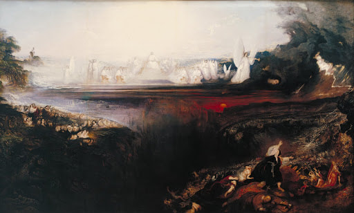 John Martin, Last Judgment, oil paint on canvas, 1854
|
.jpg)