|
by Saffron Sener 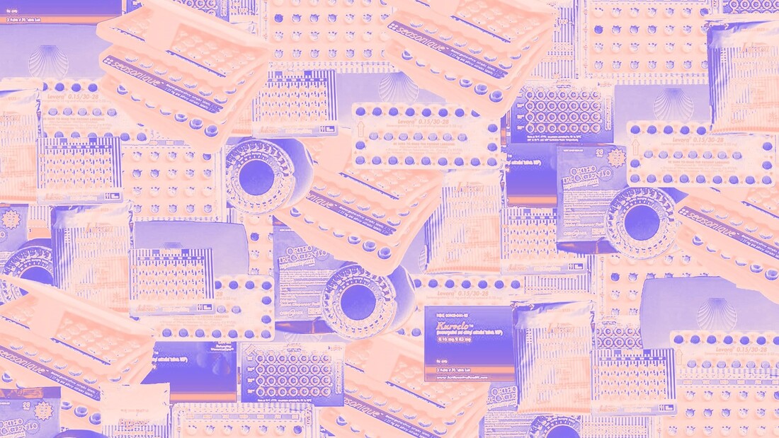 When I started taking birth control pills, I imagined that they would come in some plastic case, probably pink or lavender, slightly reminiscent of a Polly Pocket case or a compact mirror. I’m not quite sure why. Did I see this in a movie? Art? Advertisements? A baseless assumption?
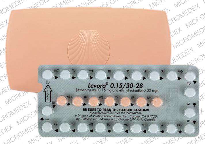
I picked up my prescription from Walgreens, waiting until I returned home to open the box. There wasn’t a whole lot that I looked forward to with the pill - beyond pregnancy prevention, it left me with the fear of becoming a hormonal mess for a few months while I adjusted. So I really wanted that cute, plastic case. Something about it was so appealing; it was a special container, a little home to these oh-so-important pills. But when I opened the box, I didn’t find a plastic case. I found a piece of cardboard-esque material, folded over once like a booklet and encasing a foil package full of pills. The color scheme was kind-of cute, yellow and orange and pink, but where was my case? Where was my pills’ cute home?* There are so many brands of the birth control pill. And they all look so different. Why? What creative drive is motivating these companies? To answer this question, I’d like to conduct a basic analysis of six oral contraceptive brands and their respective designs. They include, in no particular order: Kurvelo, Levora, Seasonique, Jolessa, Enpresse, and Ortho Tri-Cyclen. Each name is hyperlinked with images of the brand’s pill pack; feel free to reference these images throughout the article. They are the same ones I based my analysis on. One baseline throughout pills that determines an aesthetic choice is the inclusion of at least two pill colors. For the combination pill, at least. This indicates to the consumer which pills contain hormones and which are the placebo, or inactive, pill. Kurvelo opts for an orange hormonal pill with a pink placebo, similar to Levora’s pink placebo and white hormonal. Seasonique’s turquoise pill perfectly matches its case (what a statement!) and is paired with a light orange placebo. Enpress and Ortho Tri-Cyclen’s pills assume a multitude of colors; for the former, pills move from pink, white, orange, to a greenish blue while Ortho Tri-Cyclen’s pills fade from white to blue to green. Interestingly, the most utilized colors appear to be orange, white, pink, and blue/green - consistent also with packaging. Across these six examples, not a shred of purple or brown or even black beyond the typeface is to be found, really. So, it becomes clear that one wants warmer tones, sometimes earthy, when it comes to their pill - but why? Orange and yellow communicate a certain energy, almost happiness. Pink - well, that’s the girl color, right? (ha, ha). White is simple, clear, unassuming. And blue/green are calm, like nature, not scary. I wouldn’t be opposed to a goth, all-black pill pack, but a brown one… maybe that’s too earthy. The typeface is typically black, other than in Jolessa and Enpresse, whose brighter colorways keep the more colorful text in line. Other than in the brand name, it’s always sans serif. The scary medicine words are the casual font while the brand name is a professional counterpart, serif and all. The lucky ones, Levora, Seasonique, and Ortho Tri-Cyclen, come in that coveted plastic case. Levora’s could almost be an accessory by choice - light pink, with a seashell embossed on the front. Ortho Tri-Cyclen resembles more a pale yellow compact mirror, while Seasonique appears to be a more practical way to hold its multiple layers of pills. So, for me - Levora wins. But the choice of a seashell relief stands out. It’s cute, but there are implications. Seashells symbolize fertility (which I’m trying to avoid by taking the pill - some irony?) and femininity. Some light research yielded that the scallop shell represents salvation in Christianity. Either way, still interesting and somewhat surprising meanings. I must say that I appreciate the pinstriping of the Jolessa and Enpresse packages. Extremely similar in their overall “look”, these two brands overlap in their striping, menstrual pad-looking outer packages, and layout of pills and words. Both appear to be produced by Barr Pharmaceuticals, so this likeness makes sense. Nevertheless, it’s still worth noting. Is there a deeper meaning to be reached with the comparison of birth control pill packages? Likely not. But, they represent a niche, aesthetic design that is somehow extremely varied and quite similar. All of the packages sort-of look like they were created in the late ‘80s or early ‘90s, but they assign a particular warmness, almost a personality, to an otherwise sterile medicinal practice. Unlike a generic orange pill bottles, these packages have life - they are all different, sometimes cute and sometimes not, with some correlation but lots of divergence. There is a person, or a group of people, behind these appearance-based decisions; there is some arbitrariness in whether the package is a circle or a rectangle, yellow or pink, cardboard or plastic. This is an untapped alcove of vernacular aesthetic design - look out for how your birth control pill package compares. . * Would it be a home or an apartment building? I mean, seeing how each pill is in its own plastic case, maybe it’s an apartment building? But I guess an apartment can be a home. Or is a pill pack truly a cooperative?
0 Comments
Leave a Reply. |