|
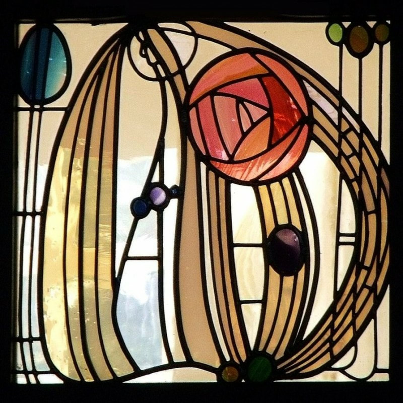
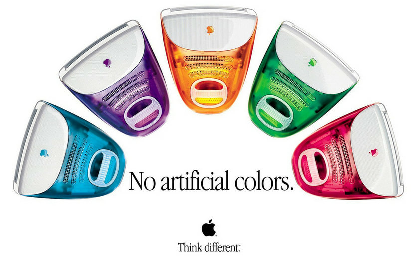
by Akshata Atre The letter K and an apple. When it boils down to it, those are the two degrees of separation between the two images above. But that’s not exactly the whole story. The turn of the nineteenth century was a critical moment for architecture and design. All throughout the 1800s, since the Industrial Revolution, architects and artists were grappling with how to deal with and interpret a newly mechanized society. For the most part, these designers remained trapped in the past, relying heavily on Classical design elements to cover up the nuts and bolts of the machine age to maintain some sanity amidst all this change. Ultimately, however, this masking of steel, iron, and glass became less and less feasible. And, slowly, architects and artists began to embrace the machine age and let go of Classicism. Charles Rennie Mackintosh (1868-1929) was one such designer. Part of the Art Nouveau movement, Rennie began experimenting with new design elements such as bold lines, the whiplash curve, and bright colors. He turned to nature for inspiration and ultimately created work such as the stained glass depicted above. This change in design ideology lay on the cusp of what would become known as modernism - although Mackintosh himself was not necessarily a modernist. However, there is no doubt that his work was influential. Just compare his stained glass work to the iMac computers in the right hand image. These 1990s computers and Mackintosh’s early 20th century art are, arguably, two sides of the same coin. It’s not that much of a stretch to make this claim - just start with the colors. The palette is almost identical. Teal, purple, orange, green, pink. I mean, sure, colors are just colors, but design before Mackintosh was pretty much devoid of these kinds of hues. The most famous European and American architectural monuments from before this era were usually white, occasionally trimmed with gold, dark reds, and oxidized greens. The transparency of the colors too is quite similar, a new quality for both of these pieces in their respective eras.
And then there’s the simple boldness of the curves. As mentioned earlier, Mackintosh makes use of the classic Art Nouveau whiplash curve. The iMac is also defined by a strong curve (what we affectionately used to call a bubble butt back when these computers were the norm), a curve that was absent from computers that came before it. This curve made the iMac friendlier, easier to grasp. Similarly, the whiplash curve was an energetic departure from the severity of Classical design, although it was imbued with a sense of violence. But here’s the kicker: the “Macintosh” was not, in fact, named after Charles Rennie Mackintosh. It was named after an apple, the McIntosh (an apt choice for a company named Apple). But the Mac might as well have been short for Mackintosh - the resemblances between the two design concepts are uncanny. And from a design perspective, there could not have been a Mac without Mackintosh (unless, of course, you think the creators of “The Jetsons,” the actual inspiration for the iMac design, could have started such an art movement on their own). Were it not for the Art Nouveau movement and its proliferation of new, colorful, and dynamic designs, architects and designers might have continued relying on Classical motifs for their work as they had been for the past three centuries. And if that were the case, computers would probably look a lot different than they do now. But that’s not what happened. And thus we are left with a wonderful historical occurrence in which the Macintosh happens to be a descendent of Mackintosh.
0 Comments
Leave a Reply. |
Archives
March 2024
Writers
All
|

